
Sign boards are integral to your daily lives, guiding you, informing you, and influencing your decisions. But have you ever stopped to think about how the design of these sign boards can impact your perception of a business or location? This article delves into the fascinating world of signage psychology, exploring how colour and typography choices can have a profound effect on the way you perceive and interact with the world around you.
The Power of Color
Colour is one of the first things your brain processes when you encounter a sign board. Different colours evoke different emotions and associations. For example, vibrant reds may create a sense of urgency or excitement, while calming blues can convey trust and reliability.
Branding and Recognition:
Consistency in colour across a brand’s signage helps establish strong brand recognition. Think about iconic brands like McDonald’s with its golden arches or Coca-Cola with its red and white signage – the colours have become synonymous with the brands themselves.
Cultural Context:
Colours can carry different meanings in different cultures. For example, in Western cultures, white symbolises purity and cleanliness, while in certain Eastern cultures, it symbolises mourning. Understanding cultural colour associations is crucial for businesses with a global audience.
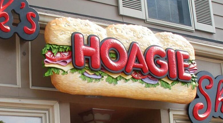
Typography: Readability and Legibility:
The choice of typography on a signage can greatly affect its readability and legibility. Fonts with clean lines and good spacing are easier to read from a distance, ensuring that the message gets across effectively.
Personality and Tone:
Typography also conveys the personality and tone of a brand or location. Playful and whimsical fonts suggest a fun and casual atmosphere, while sleek and modern fonts convey professionalism and sophistication.
Emphasis and Hierarchy:
Typography allows signage to emphasise key information and establish a visual hierarchy. The size, weight, and style of fonts can guide the viewer’s attention to the most important details, such as a business name or a call to action.
Street Signs and Navigation:
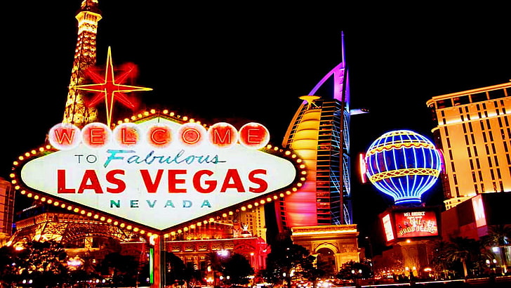
Street signs use a combination of colour and typography to provide critical information quickly and efficiently. Clear, high-contrast lettering on a green background, for example, signals that you’re on the right track as you follow navigation signs.
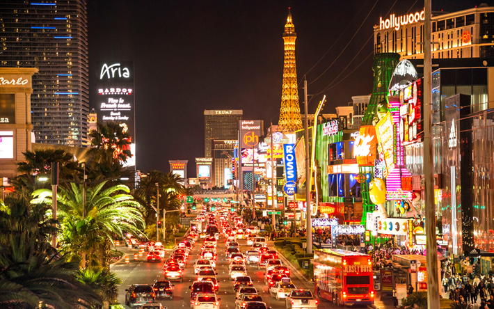
Retail and Storefronts:
Retailers use it strategically to attract customers. Bold and vibrant colours paired with eye-catching typography can draw shoppers into stores, while elegant and refined designs may be more appropriate for high-end boutiques.
Restaurant Menus:
Typography and colour choices on restaurant menus play a crucial role in influencing diners’ choices. Playful fonts for kids’ menus, elegant scripts for fine dining, and vibrant colours for fast-food establishments all contribute to the overall dining experience.
The Subtle Art of Persuasion
It often includes a call to action, urging viewers to take a specific step, such as “Buy Now” or “Visit Today.” The colour and typography used for these messages can make them more compelling and persuasive.
Trust and Credibility:
A well-designed one can convey trust and credibility. For example, a law firm with classic and professional signage is more likely to instil confidence in potential clients.
Emotional Connection:
It can create an emotional connection with viewers. A warm and inviting sign for a cosy café, with the right colour palette and typography, can make patrons feel welcomed and at home.
Typography’s Subliminal Messages:
Spacing and Kerning: The space between letters and words, known as kerning and tracking, can significantly impact how we perceive text. Tight spacing can convey urgency and density, while generous spacing promotes a sense of openness and tranquillity.
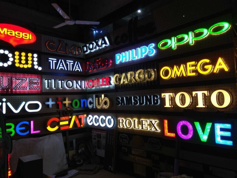
Typeface Personality: Different typefaces carry distinct personalities. For instance, a bold and angular typeface can convey strength and assertiveness, whereas a cursive script typeface might suggest elegance and sophistication. Businesses carefully select typefaces that align with their brand’s identity and values.
Cultural Considerations:
Colour Symbolism Across Cultures: Colours often carry different cultural connotations. For example, while white represents purity in Western cultures, it symbolises mourning in some Asian cultures. Understanding these cultural nuances is crucial when designing signboards for diverse audiences.
Typography Across Languages: Sign boards often feature text in multiple languages in a globalised world. Designers must consider the readability and cultural appropriateness of typefaces for different languages to ensure effective communication.
The Evolving Role of Sign Boards:
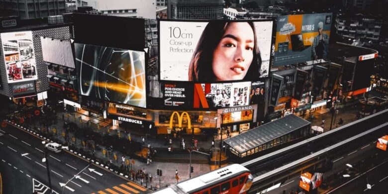
Digital Signage and Interactivity: With the advent of digital technology, signboards have evolved beyond static displays. Dynamic digital signage allows businesses to engage with customers in real-time, showcasing dynamic content and adapting to changing circumstances.
Environmental Signage: Sign boards aren’t limited to businesses. They also serve essential roles in guiding people through public spaces, transportation hubs, and emergency situations. The design of environmental signage must prioritise clarity and functionality while still considering aesthetic elements.
The Art of Colour Combinations:
Contrast and Legibility: The combination of colours on a sign board can greatly affect its legibility. High-contrast colour pairings, such as black and white, enhance readability, making the message clear and easy to grasp. Conversely, low-contrast combinations might create visual confusion, potentially deterring customers.
Colour Harmony: Just as in music, colour harmony is crucial in design. Using colour wheels and theories, designers can create harmonious sign boards that evoke specific emotions. Complementary colours, like red and green, create vibrancy, while analogous colours, such as blue and purple, offer a sense of calm and unity.
Serif vs. Sans Serif Fonts: Tradition vs. Modernity
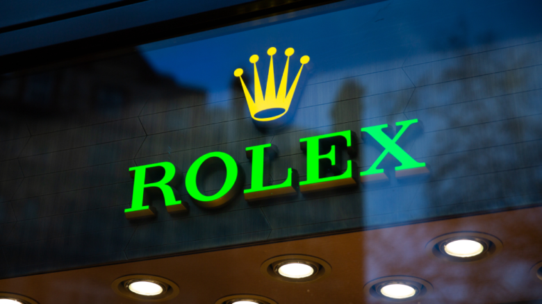
Serif fonts, with their decorative lines at the ends of letters, often convey a sense of tradition and reliability. They are commonly used in law firms or established institutions. On the other hand, sans-serif fonts, which have clean, straight lines, are associated with modernity and simplicity. Tech companies and startups often opt for sans-serif fonts to convey innovation.
Font Size: The Hierarchy of Information
The size of the font on a signboard can dictate the hierarchy of information. Larger fonts draw immediate attention and are often used for headlines or important announcements. Smaller fonts are typically reserved for details or fine print. The careful use of font size ensures that viewers grasp the most critical information first.
Script Fonts: Adding a Personal Touch
Script fonts, which resemble handwriting, add a personal and sometimes elegant touch to sign boards. They are often used by boutique businesses or artisans to convey a sense of craftsmanship and uniqueness. However, script fonts should be used sparingly and in a way that maintains readability.
Conclusion
The psychology of signage is a multifaceted field that combines colour theory, typography principles, and the art of persuasion. Businesses and organisations around the world recognise the profound impact that well-designed sign boards can have on perception, recognition, and success. The next time you encounter signage, take a moment to consider the subtle cues of colour and typography at play, and you’ll gain a deeper appreciation for the art and science of signage.